Understanding Analytics
How to use analytics to measure and improve your mentorship program
Programs that measure outcomes consistently outperform those that run on gut feel. The Analytics page turns your program's raw activity into actionable signals, so you can double down on what's working, catch disengagement before it becomes attrition, and demonstrate concrete impact to stakeholders.
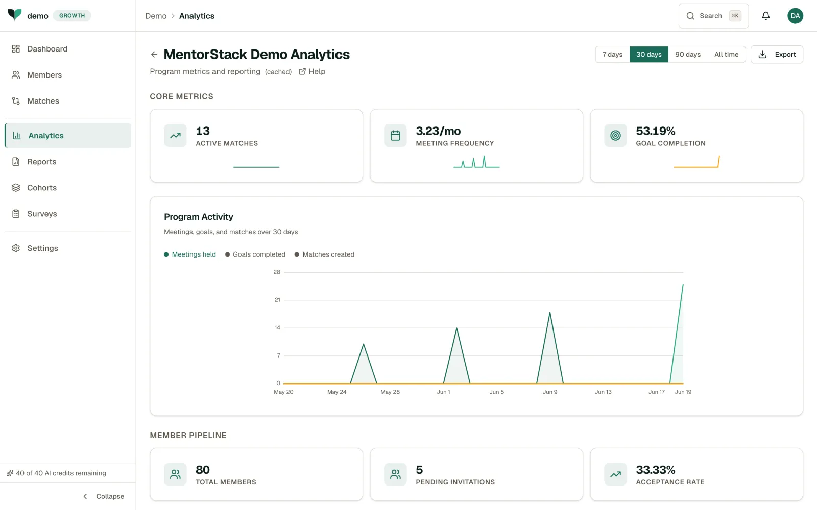
Date Range
Use the time-range tabs at the top to filter analytics by time period. Options are 7 days, 30 days, 90 days, and 12 months.
Core Metrics
The analytics dashboard surfaces three headline numbers:
- Active Matches: The count of currently active mentoring pairs. This is your program's vital sign: if it's declining, investigate whether pairs have gone quiet or are ending early.
- Meeting Frequency: Average meetings per match per month, expressed as a rate (e.g. 3.23/mo). Research shows that pairs meeting at least twice a month see significantly better outcomes. Use this metric to set expectations.
- Goal Completion: The percentage of goals that have been marked complete. Low completion may mean mentees need help defining achievable objectives, not that they lack motivation.
Program Activity
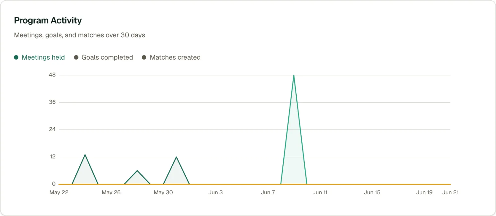
The Program Activity chart tracks meetings held, goals completed, and matches created over the selected date range. Look for:
- Growing meetings held: Are more pairs meeting regularly?
- Goal completion trends: Are mentees achieving their objectives?
- Match creation spikes: Do these align with cohort launches or enrollment pushes?
Tip
Compare different date ranges to spot seasonal patterns or measure the impact of program changes.
Member Pipeline
Below the chart, the Member Pipeline section shows:
- Total Members: The total headcount enrolled in the program
- Pending Invitations: Invitations that have been sent but not yet accepted
- Acceptance Rate: The percentage of sent invitations that have been accepted
Leadership Readiness
Open the Leadership Readiness tab on the Analytics page for a per-participant rollup: goal velocity, skill lift, badges earned, and mentoring tenure, in one table. Use it to identify who is ready for more responsibility, and to back that call with evidence instead of gut feel.
Program admins can see each member's progress metrics, including goals completed, skill growth, badges, and mentoring tenure. Participants see their own numbers on their Portfolio.
Each row shows:
- Goals Completed and Avg Completion (days): how many goals a participant has finished, and how quickly
- Skills Improved and Avg Level Gain: how many of their tracked skills moved up a level, and by how much on average
- Badges: every badge earned, mentor and mentee badges both
- Tenure Since: when the participant's first match began
- Active and Completed: their current and past match counts
Filter by role, badge, minimum goals completed, or search by name.
Note
The rollup itself is available on every plan. Export CSV requires the Starter plan and above, the same reporting tier used by Generating Reports.
Exporting Data
Click Export to download analytics data as a Markdown report for further analysis or reporting to stakeholders (Starter and above).
Acting on Your Insights
- Set a weekly review rhythm. Five minutes scanning the dashboard each week lets you intervene early instead of discovering problems at the end of a cohort.
- Use trends, not snapshots. A single week's dip isn't a crisis, but a three-week decline is a pattern. Compare date ranges to separate signal from noise.
- Connect metrics to actions. Low engagement rate? Reach out to quiet pairs. Low goal completion? Review whether your goals need adjustment. Every metric should map to a response.
- Share wins with stakeholders. When goal completion or engagement is trending up, export the data and share it. Visible impact is what secures continued investment in your program.